
(BigData Analysis 도전기) Kaggle Geospatial Analysis Tutorial (3. Interactive Maps)
by 줌코딩
Introduction
- 이제 3개 남았다 좀만 힘내자.
- 이번 튜토리얼에서는 folium package를 이용해서 interactive한 맵을 만드는 방법에 대해 배워볼 것이다.
- Boston의 범죄 데이터를 이용해서 시각화 해볼 예정이다.
import folium
from folium import Choropleth, Circle, Marker
from folium.plugins import HeatMap, MarkerCluster
embed_map()이라는 함수를 만들어서 interactive map을 만드는데 사용해보자.- 이 함수는 두개의 parameter를 받는데 하나는 map의 이름이고 하나는 저장될 html이름이다.
# Function for displaying the map
def embed_map(m, file_name):
    from IPython.display import IFrame
    m.save(file_name)
    return IFrame(file_name, width='100%', height='500px')
Your first interactive map
- 일단
folium.Map()이라는 함수에서 시작해보자.
# Create a map
m_1 = folium.Map(location=[42.32,-71.0589], tiles='openstreetmap', zoom_start=10)

# Display the map
embed_map(m_1, 'm_1.html')
- 이 함수를 진행하면 다음과 같은 맵이 생성될 것이다.
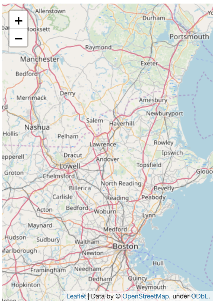
- folium.Map에는 parameter를 받아서 map의 형태를 정해주는 방법이 있다.
location은 지도의 중심점을 잡아준다.tiles는 지도의 스타일을 정한다.zoom_start는 얼마나 줌인된 상태로 시작할지 정하는 것이다.
The data
- 이제 우리는 범죄 정보를 map에다가 추가해 볼 것이다.
- 여태까지 파일 받는 방법에 대해서는 많이 배워봤기 때문에 이 과정은 스킵하도록 하겠다.
- 하지만 일단 crimes는 2018년도 이후 범죄 정보가 담긴 GeoDataFrame이다.
Plotting points
- 일단 너무 데이터를 많이 주지 않기 위해서 낮시간에 일어난 범죄만 추려보겠다.
daytime_robberies = crimes[((crimes.OFFENSE_CODE_GROUP == 'Robbery') & \(crimes.HOUR.isin(range(9,18))))]
folium.Marker
- 이제
folium.Marker()라는 함수를 이용해서 지도에 범죄의 위치를 표시해보겠다.
# Create a map
m_2 = folium.Map(location=[42.32,-71.0589], tiles='cartodbpositron', zoom_start=13)

# Add points to the map
for idx, row in daytime_robberies.iterrows():
    Marker([row['Lat'], row['Long']]).add_to(m_2)

# Display the map
embed_map(m_2, 'm_2.html')
- 그러면 이제 맵에 하나씩 다음과 같이 표시되게 된다.

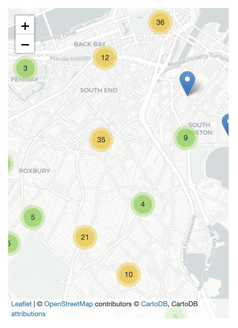
folium.plugins.MarkerCluster
folium.plugins.MarkerCluster()를 이용하면 묶어줄 수 있다.- 각각의 marker를 MarkerCluster object에 추가시켜줄 수 있다.
# Create the map
m_3 = folium.Map(location=[42.32,-71.0589], tiles='cartodbpositron', zoom_start=13)

# Add points to the map
mc = MarkerCluster()
for idx, row in daytime_robberies.iterrows():
    if not math.isnan(row['Long']) and not math.isnan(row['Lat']):
        mc.add_child(Marker([row['Lat'], row['Long]]))
m_3.add_child(mc)

# Display the map
embed_map(m_3, 'm_3.html')
- 위의 코드를 통해 비슷한 지역에 있는 애들을 묶어줄 수 있도록 cluster에 넣어준다.
- 그럼 다음과 같은 결과를 얻을 수 있다.
Bubble maps
- map에다가 점들을 추가하고 싶다면 다음과 같은 코드를 진행하면 된다.
# Create a base map
m_4 = folium.Map(location=[42.32,-71.0589], tiles='cartodbpositron', zoom_start=13)

def color_producer(val):
    if val <= 12:
        return 'forestgreen'
    else:
        return 'darkred'

# Add a bubble map to the base map
for i in range(0,len(daytime_robberies)):
    Circle(
        location=[daytime_robberies.iloc[i]['Lat'], daytime_robberies.iloc[i]['Long']],
        radius=20,
        color=color_producer(daytime_robberies.iloc[i]['HOUR'])).add_to(m_4)

# Display the map
embed_map(m_4, 'm_4.html')
- 위의 코드를 진행하면 12시 이전 값들에 대해서는 초록원, 이후 값들은 빨간원이 생기는 것을 볼 수 있다.
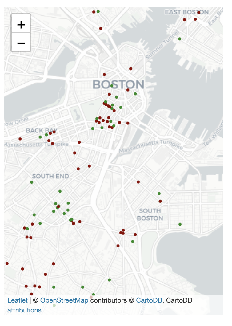
- 이때 주의할 점은
folium.Circle()은 여러개의 값을 받는다는 점이다.location은 점의 위치,radius는 원의 반지름,color은 색의 종류을 의미한다.- 이때, 값을 지정해주지 않고 위의 코드와 같이 함수를 이용해서 지정해줄 수도 있다.
Heatmaps
- 이번에는 heatmap이다.
- 각 지역의 범죄 빈번도를 나타내기 위해서 heatmap을 사용할 수도 있다.
# Create a base map
m_5 = folium.Map(location=[42.32,-71.0589], tiles='cartodbpositron', zoom_start=12)

# Add a heatmap to the base map
HeatMap(data=crimes[['Lat', 'Long']], radius = 10).add_to(m_5)

# Display the map
embed_map(m_5, 'm_5.html')
- 이를 통해 다음과 같은 맵을 만들어 낼 수 있다.
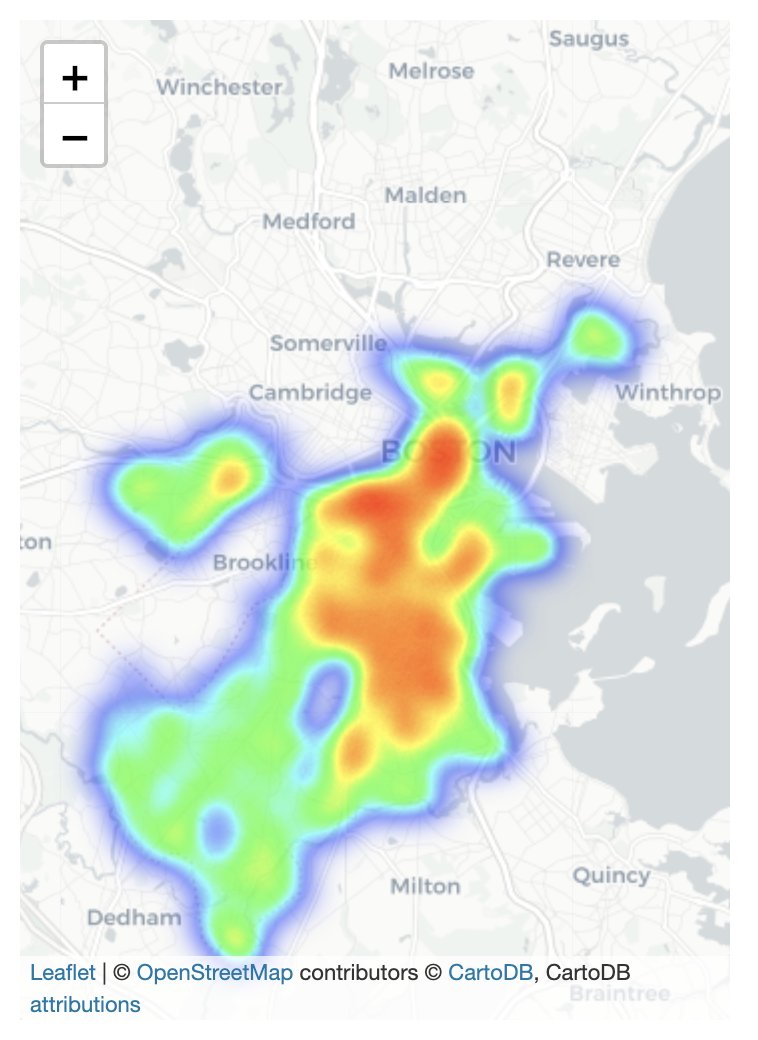
- heatmap의
data는 location의 정보가 담긴 DataFrame을 의미하고radius는 smoothness를 의미한다.
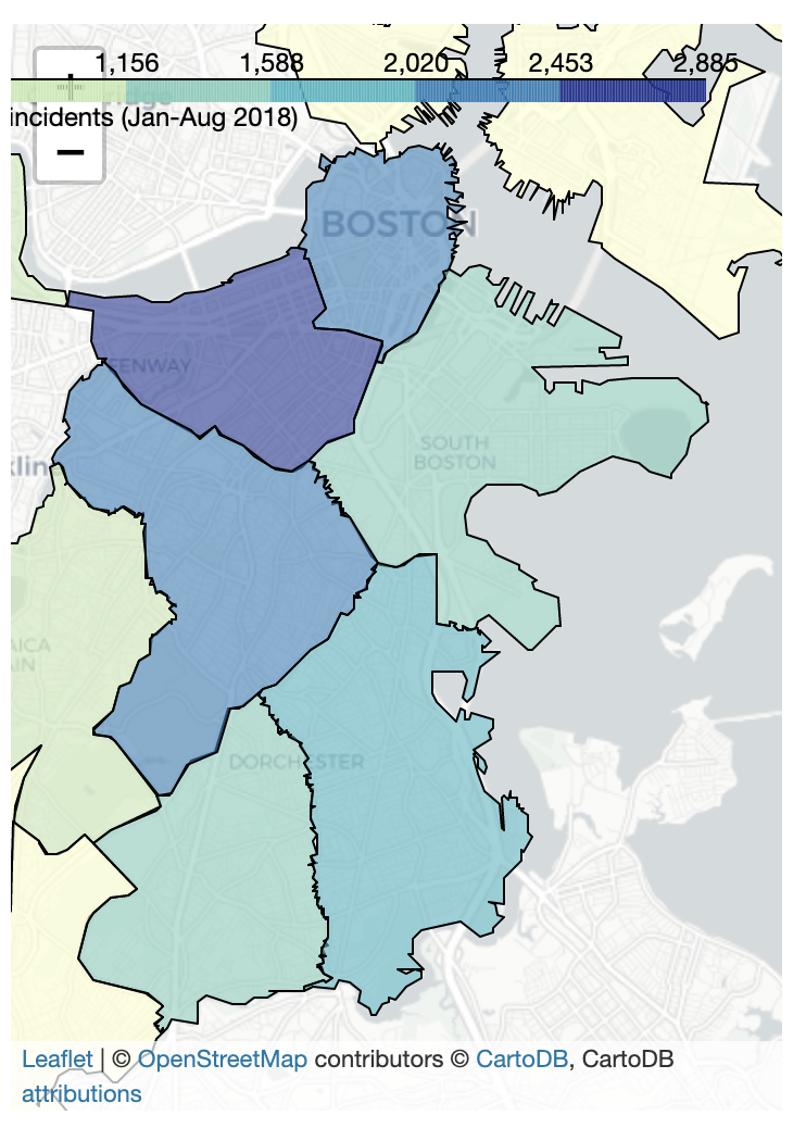
Choropleth maps
- 범죄가 경찰 관리 영역별로 어떻게 다른지 보고 싶다면 choropleth map을 활용하면 된다.
- 먼저 District별로 Geometry를 가지고 있는 GeoDataFrame을 만들어보자
districts_full = gpd.read_file('../input/geospatial-learn-course-data/Police_Districts/Police_Districts/Police_Districts.shp')
districts = districts_full[["DISTRICT", "geometry"]].set_index("DISTRICT")
- 그리고 value_counts함수를 이용해서 각 DISTRICT의 범죄 개수를 확인해보자.
plot_dict = crimes.DISTRICT.value_counts()
- 그 후 Choropleth 함수를 이용해서 구현하면 결과를 확인할 수 있다.
# Create a base map
m_6 = folium.Map(location=[42.32,-71.0589], tiles='cartodbpositron', zoom_start=12)

# Add a choropleth map to the base map
Choropleth(geo_data=districts.__geo_interface__,
        data=plot_dict,
        key_on="feature.id",
        fill_color='YlGnBu',
        legend_name='Major criminal incidents (Jan-Aug 2018)'
        ).add_to(m_6)

# Display the map
embed_map(m_6, 'm_6.html')
folium.Choropleth()함수는 여러개의 인자를 받는다.geo_data는GeoJSON FeatureCollection이라는 각 지역의 경계 값을 가지고 있는 데이터를 받고data는 각 지역별 값을 제공한다.key_on은 항상 feature.id란다.fill_color은 채우고 싶은 색의 범주를 의미한다.legend_name는 이 맵의 이름을 오른쪽 사단에 표시한다.
이 포스팅은 쿠팡 파트너스 활동의 일환으로, 이에 따른 일정액의 수수료를 제공받습니다.
Subscribe via RSS